Case Study: Accessibility Audit Drives UX and Business Results
Date Published: Jul 26, 2026
Date Modified: Jul 26, 2026
"Our website looks great. Why would we need an accessibility audit?" — the question that started this engagement.
At first glance the site looked modern: clean branding, smooth animations, fast pages and polished layouts. But when we tried navigating without a mouse, problems emerged.
Looking Beyond Visual Design
A beautiful website isn't always an accessible website. We began with automated accessibility tools but moved quickly to manual testing: keyboard navigation, screen readers, zoom testing, colour contrast, form interactions and PDF downloads. In a few hours we discovered dozens of barriers automated checks missed or couldn't fully evaluate.
The Problems We Found
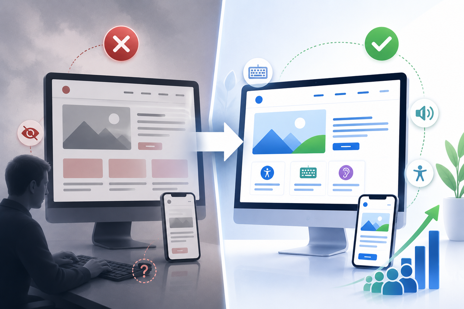
Some issues were small: images without meaningful alt text, buttons announced simply as "Button", and form fields missing labels. Others had larger impact: keyboard users unable to complete critical workflows; disappearing focus indicators; skipped heading levels; unreadable PDFs; and brand-driven colour contrast that failed WCAG requirements. Individually minor, collectively they made the site difficult or impossible for many users.
Something Unexpected
During a review with the client's marketing team the analytics and support teams offered clues: higher bounce rates, repeated form complaints. The audit revealed these were often caused by accessibility barriers — visitors left because they couldn't complete tasks, not because they lacked interest. Accessibility had quietly become a business barrier.
Remediation Begins
Instead of a full redesign we recommended targeted improvements. The development team implemented the following:
- Added semantic HTML and landmarks
- Corrected heading structures
- Improved keyboard navigation and fixed focus indicators
- Added descriptive alternative text
- Associated labels with every form control
- Improved colour contrast while keeping brand identity
- Remediated downloadable PDF documents
- Verified fixes using manual accessibility testing
Many changes were thoughtful, focused development tasks rather than full redevelopment.
The Results
Over the following months the client saw measurable improvements: longer session times, higher form completion rates, fewer usability complaints, and easier navigation across devices. Internal teams found that cleaner HTML simplified content updates. Accessibility work raised overall quality, not just compliance.
Accessibility Improved More Than Compliance
Accessibility benefits extended to users without disabilities: clearer headings aided content scanning, higher contrast improved readability in bright sunlight and on mobile devices, and clearer forms reduced errors for everyone.
A Shift in Perspective
By project end the client saw accessibility as part of product quality. Instead of asking "Do we need accessibility?" they asked "How do we make accessibility part of every future release?" — the most valuable outcome of the engagement.
The Business Impact
Accessibility removes friction: every inaccessible button, confusing form, missing heading or unreadable PDF risks losing a customer. Organisations invest heavily to attract visitors — accessibility helps protect that investment by ensuring visitors can engage, convert and return.
Final Thoughts
Accessibility doesn't ask organisations to lower design standards; it asks them to raise usability standards. The goal isn't simply to pass an audit — it's to build digital experiences people can trust, navigate and enjoy, regardless of ability.